
The Hyper-Local Discovery Engine for Specialty Coffee.
Role: Lead Product Designer
Project Type: Location-Based Marketplace
Timeline: 6 weeks (MVP Sprint)
Industry: Specialty Food & Beverage / Travel-Tech
Tools: Figma • Photoshop • FigJam
The Challenge
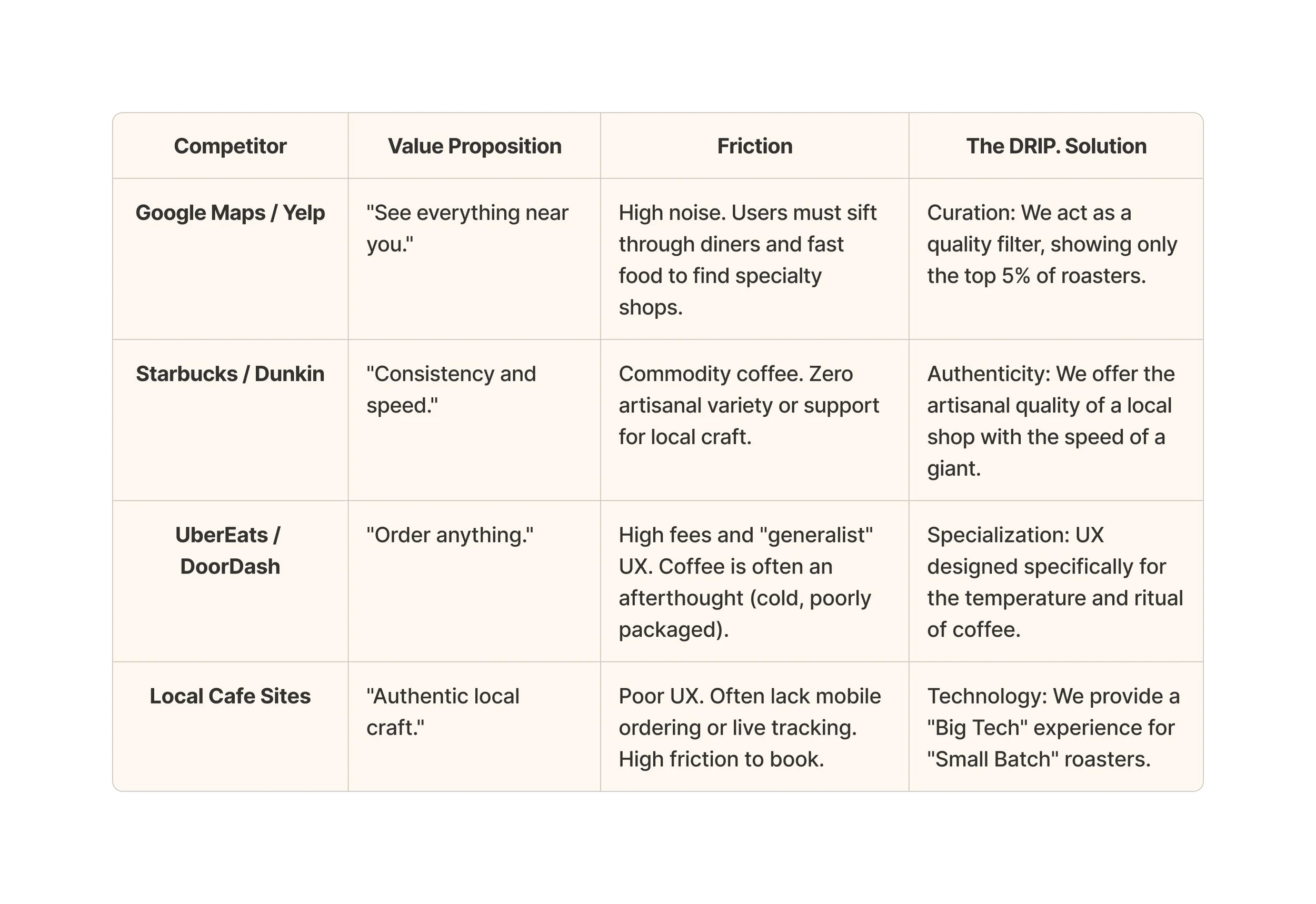
Mainstream navigation and food discovery platforms prioritize data volume over quality curation. For the specialty coffee enthusiast, searching for a good cup of coffee has become a process of siting through "fast-food chains, and generic breakfast joints which leads to wasted time and a degraded morning ritual.
The Oportunity
Travelers and niche coffee enthusiasts crave a zero-friction discovery tool that guarantees quality. By filtering the market to only include specialty roasters, DRIP. connects the high-frequency daily ritual with artisanal businesses, reclaiming the user's time and morning
The Discovery Friction:
Signal vs. Noise
General-purpose maps (Google/Apple) treat all coffee shops equally. For the high-value specialty consumer, this creates a 'Signal-to-Noise' problem. They waste 15 minutes vetting reviews just to avoid 'commodity coffee'.
The Latency Costs
Vetting Fatigue (15+ mins per search).
Inconsistent Quality Standards.
Fragmented Loyalty (No unified wallet).
Market Analysis: The "Density" Trap
Google Maps optimizes for Density (Volume). DRIP optimizes for Fidelity (Quality).
Data Signal: 15 user interviews revealed that "Specialty Drinkers" (top 10% of market value) abandon search after 15 minutes of sifting through "fast food" results.
The Gap: There is no existing filter for "Roast Date" or "Bean Origin" on major platforms.
User Sentiment: "The 'willingness-to-walk' metric: Users will travel 3x farther for guaranteed single-origin beans than for a generic latte."
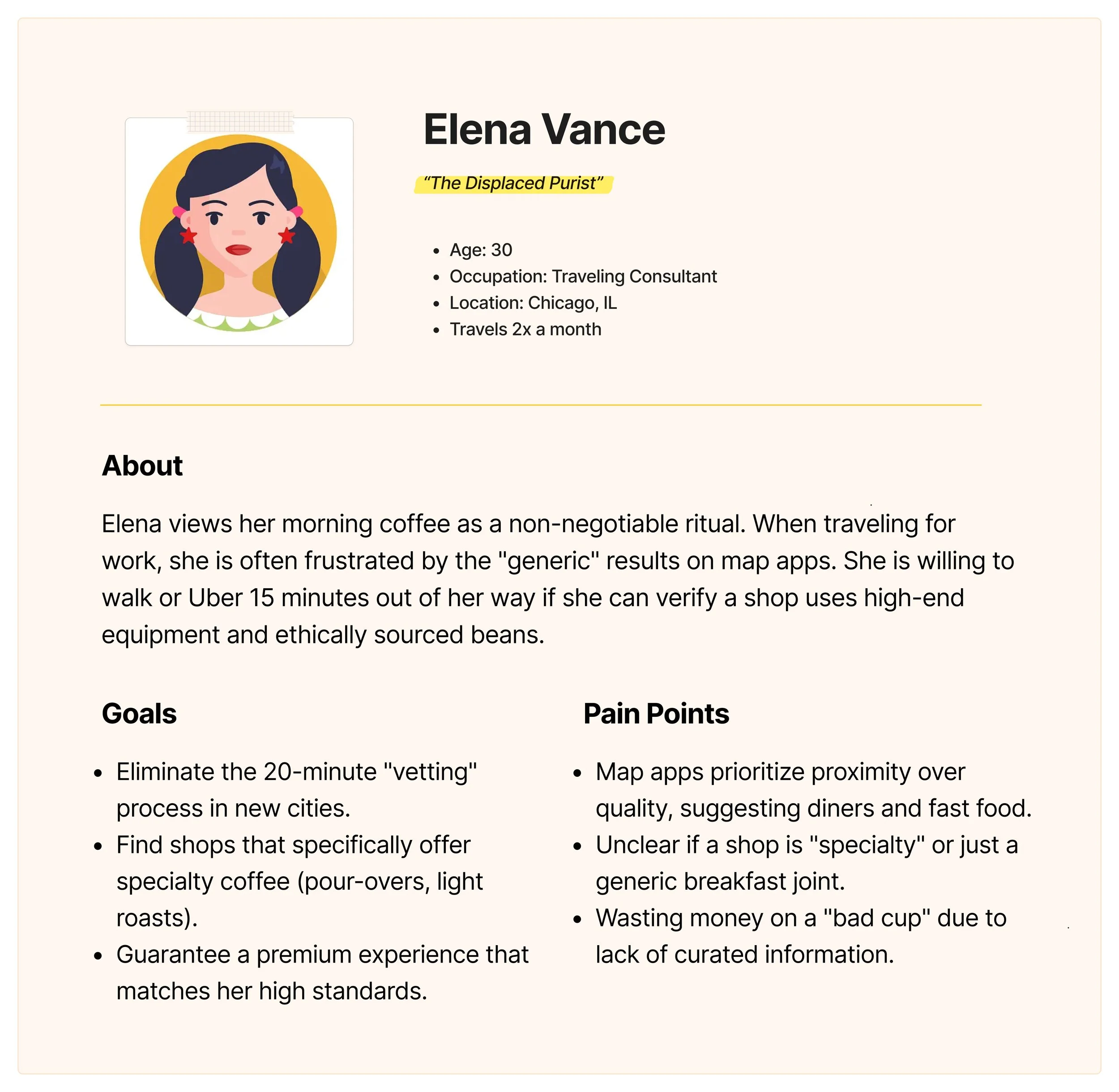
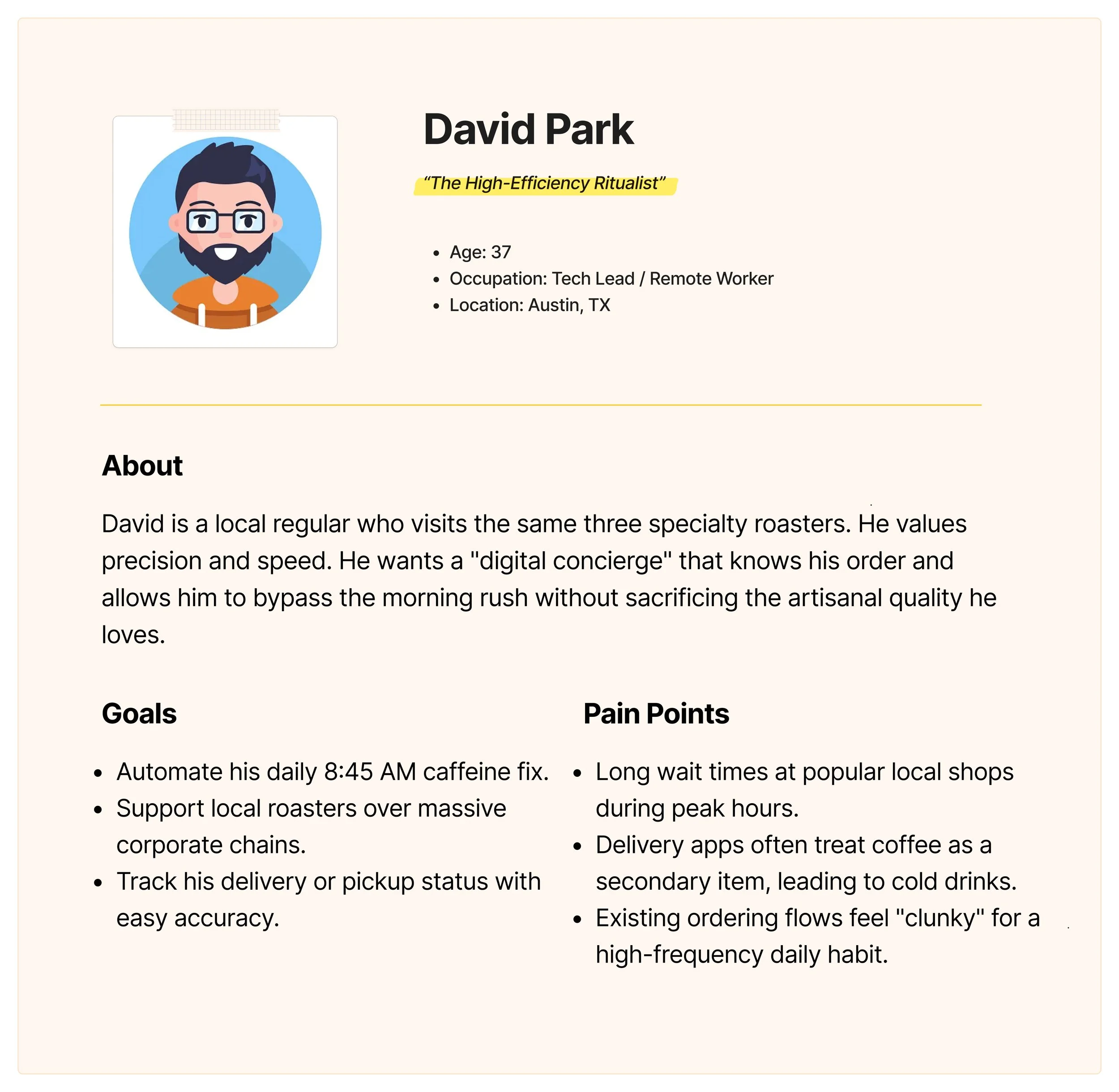
Behavioral Archetypes
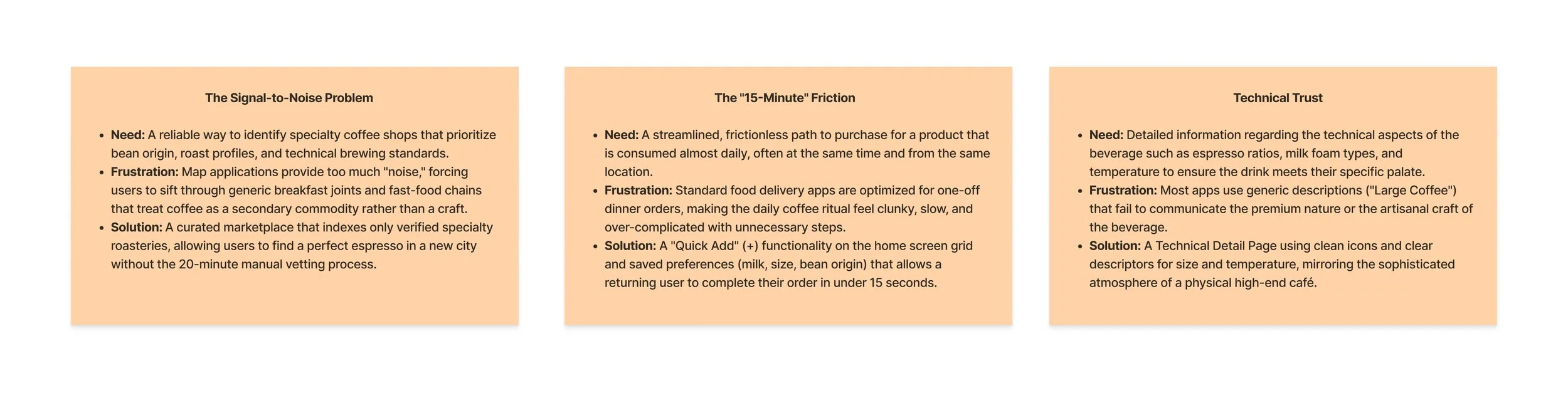
The Signal-to-Noise Problem
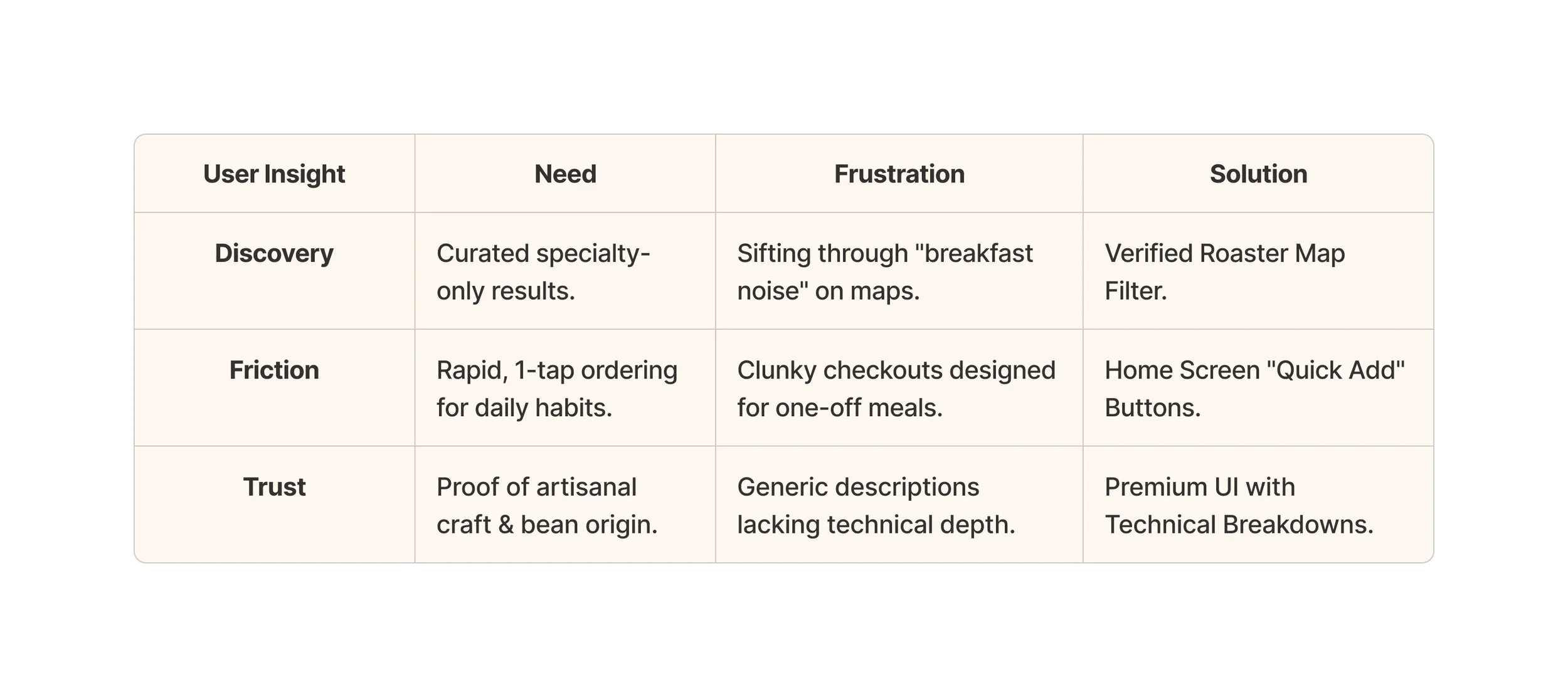
User Insight Chart
Competitive Landscape
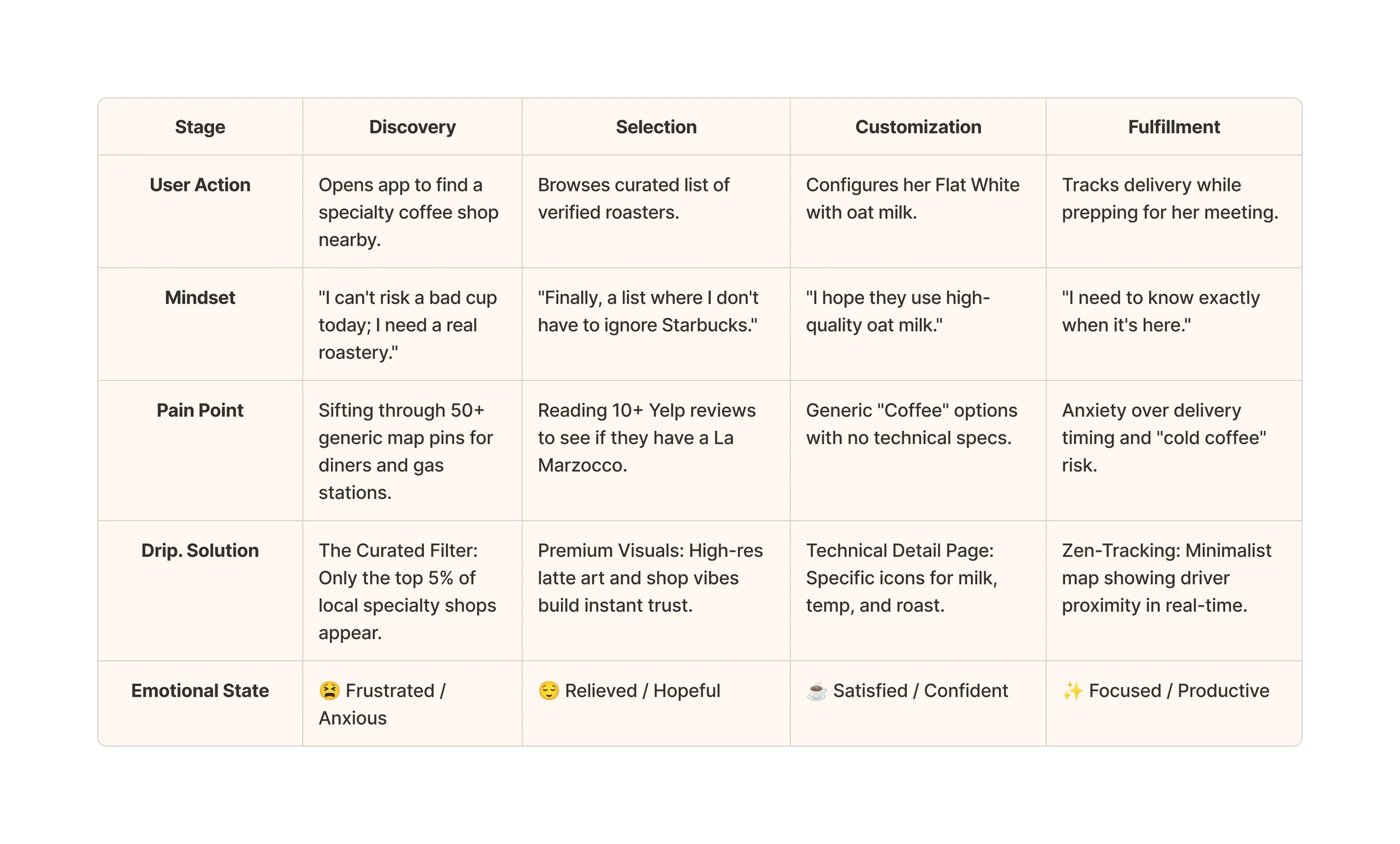
User Journey
Persona: Elena (The Displaced Purist)
Scenario: Arriving in a new city for a 9:00 AM meeting and needing to find a specialty coffee shop.
Design Analysis
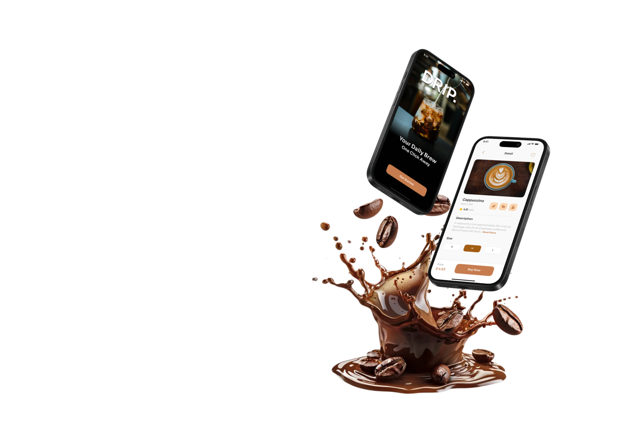
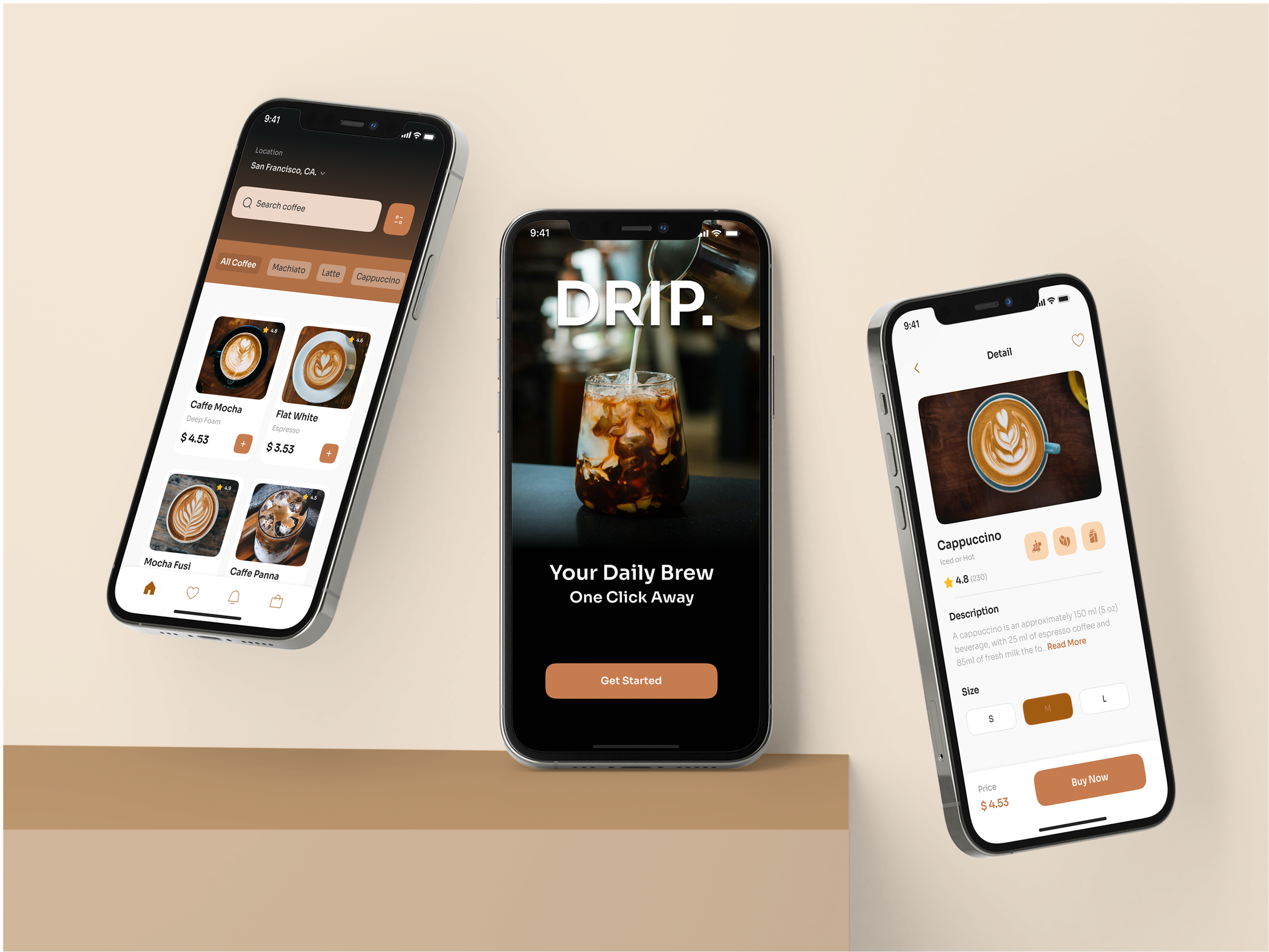
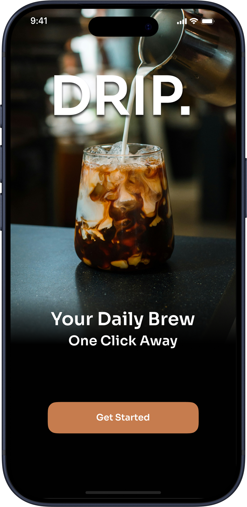
Screen 1: The "Pure" Entry
I chose a high-contrast, immersive hero image. The goal is emotional resonance.
• Design Decision: The "Get Started" button is high-contrast terracotta, specifically placed at the bottom "thumb-zone" for immediate interaction.
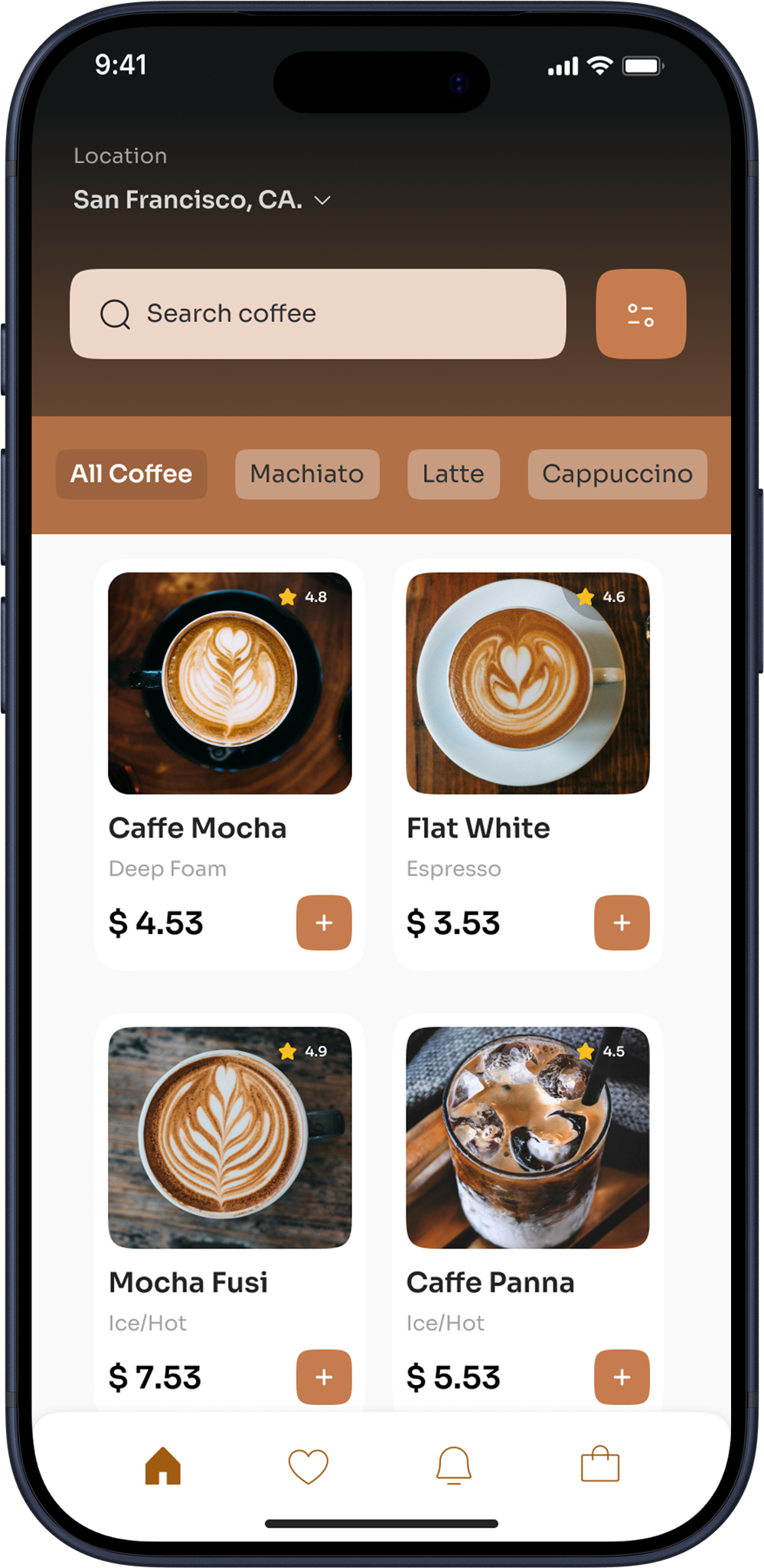
Screen 2: Curation over Quantity
The home screen doesn't just show "everything." It shows the Best Nearby.
• Analysis: Categories like "Macchiato" and "Cappuccino" are prioritized over generic "Hot Drinks" or "Coffee" signaling to the user that this app speaks their language.
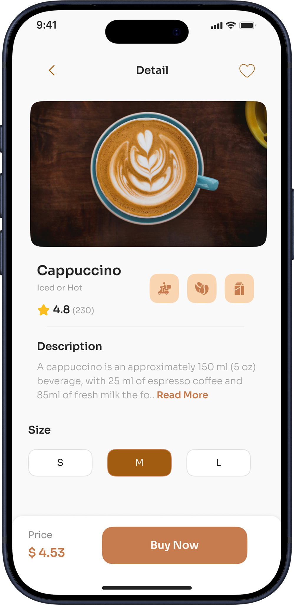
Screen 3: Technical Transparency
The Detail page highlights what matters to the niche: Bean Type, Roast level, and Size.
• Analysis: By using icons for temperature and milk, we reduce cognitive load while maintaining the a luxury feel.
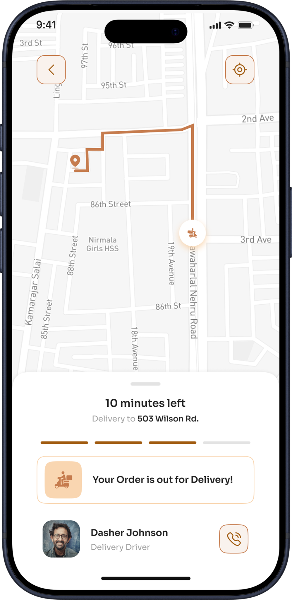
Screens 4 & 5: The "Anxiety-Free" Wait
For a traveler, knowing exactly when their coffee arrives is vital for scheduling.
• Analysis: The tracking map is clean, removing building labels to focus strictly on the delivery path, providing a easy waiting experience.
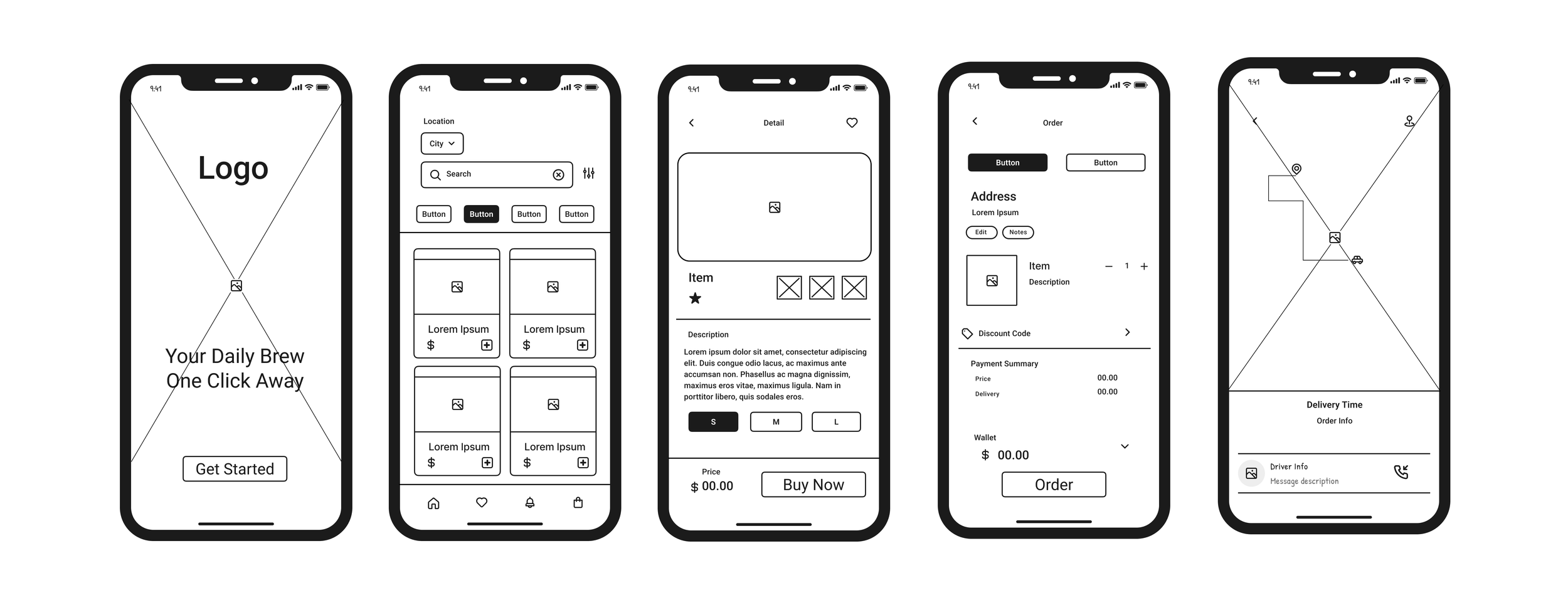
Wireframes
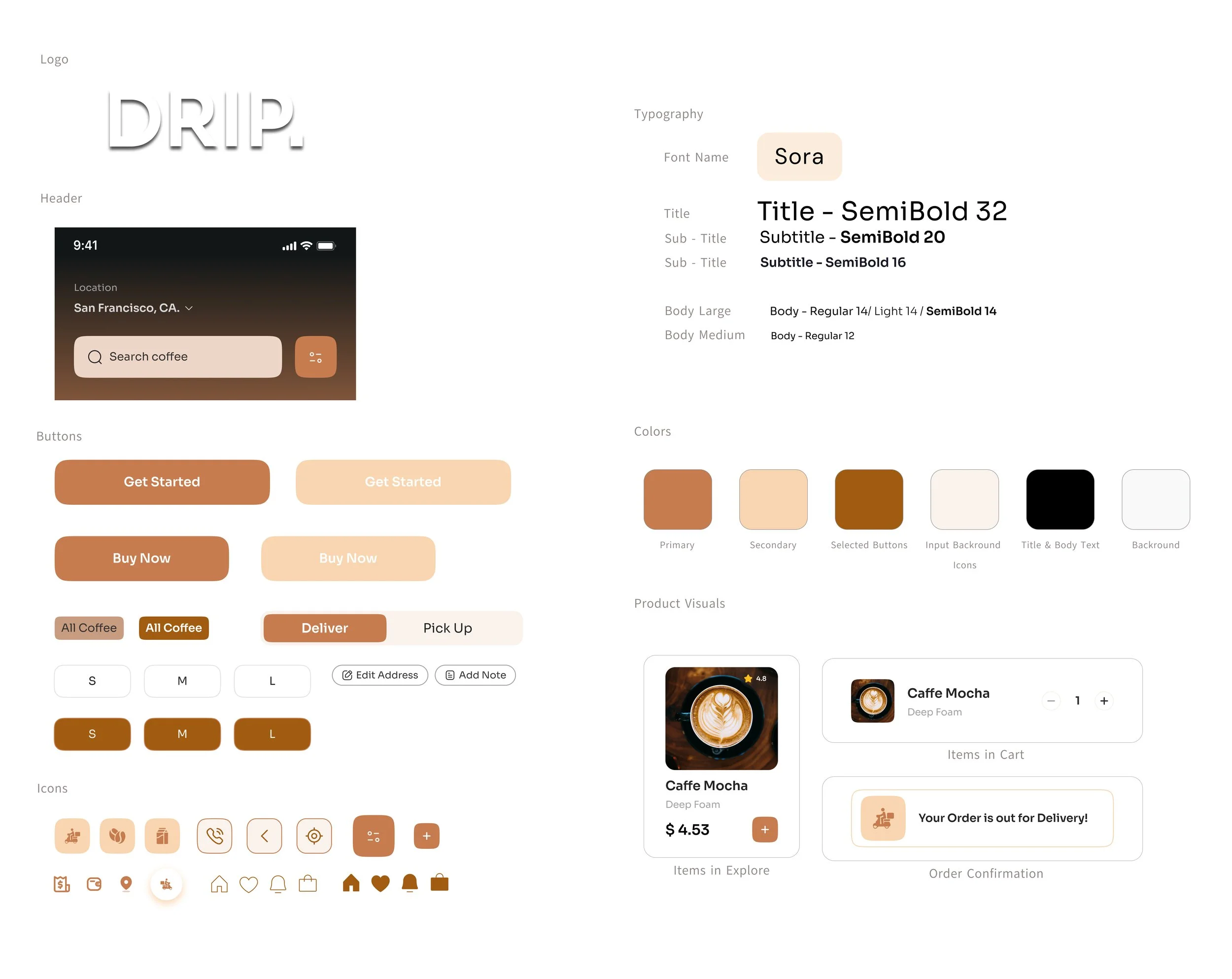
Style Guide
The Ecosystem: High-Fidelity Flow
Phone 2 (Home): "The Noise Filter: Prioritizing 'Roast Type' over 'Distance'."
Phone 3 (Detail): "Technical Trust: Icons for 'Milk Texture' and 'Bean Origin' signal quality to the purist.
Phone 5 (Map): "Zen Tracking: Removing non-essential building labels to reduce cognitive load during the 'last mile'.
Strategic Retrospective
Data Fidelity as Currency: For the 'Purist' persona, technical specs (Bean Origin, Roast Date) are not just details—they are trust signals. Prioritizing this data over 'Starbucks-style' marketing images increased perceived value.
The Power of Exclusion: By purposefully ignoring the mass market (diner coffee), we created a 'High-Signal' environment. This reduces decision fatigue for the expert user, turning a search tool into a lifestyle product.
North Star Metrics: The design architecture was engineered to hit two specific KPIs: <60s Time-to-Caffeine (Velocity) and 3.5x Weekly Frequency (Habit Formation).