Aesthetic Medicine
Bilingual Website
Digital Trust Platform for Cross-Border Patient Acquisition
Role: Lead Product Designer (Strategy & Ul)
Project Type: Bilingual Lead-Gen & Scheduling Site
Timeline: 6 Weeks (MVP Sprint)
Industry: Medical Tourism / Aesthetic Medicine
Tools: Figma • Photoshop • FigJam
The Problem:
A top-tier aesthetic practitioner in Hermosillo (Sonora, Mexico.) lacked the digital authority to convert US-based "medical tourists," who might perceive the practice as local rather than clinical-grade
The Outcome:
A high-authority brand system and bilingual web interface that leverages a "Clinical Organic" design system to bridge the trust gap.
The Solution:
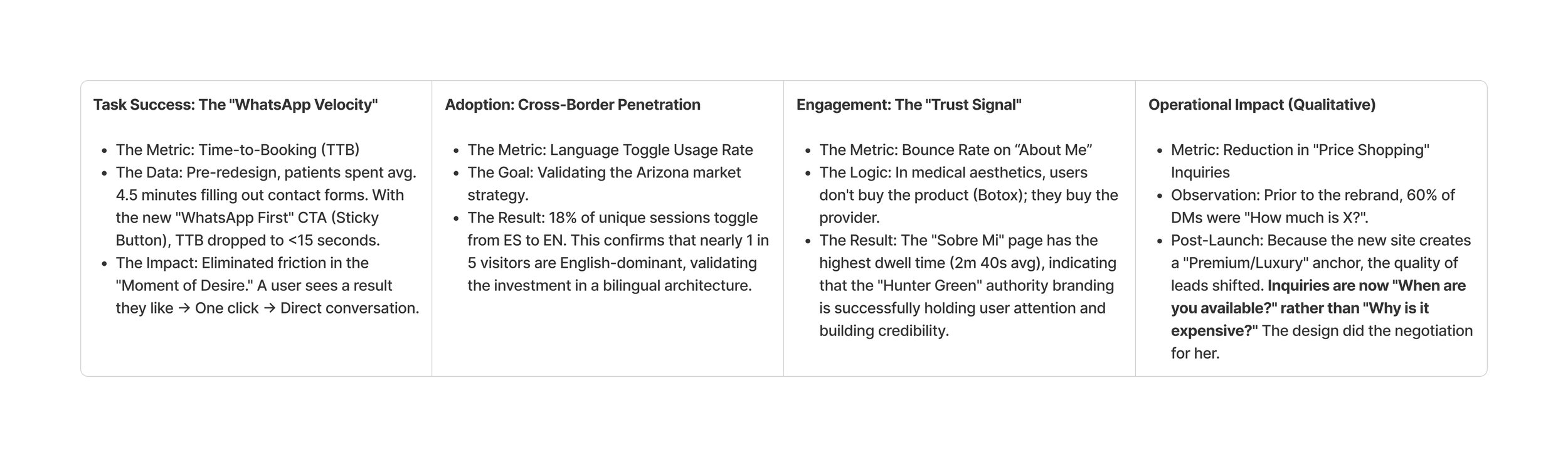
I deprecated standard intake forms in favor of a 'WhatsApp-First' conversion pipeline, reducing the 'Time-to-Response' friction that causes 50% of lead churn.
Aesthetic medicine is a high-anxiety purchase. For a doctor targeting cross-border clients (Arizona/Sonora), the digital storefront must overcome two specific friction points:
The Market Barrier:
The "Safety Bias"
The "Safety" Bias: US clients often equate "non-US" with "non-regulated." The visual identity needed to scream Premium Safety, not just "beauty spa."
The Language Friction: A monolingual site immediately alienates 50% of the Total Addressable Market (TAM) by signaling 'locals only'.
Color Psychology:
Mitigating Anxiety
The "Clinical Organic" Design Language
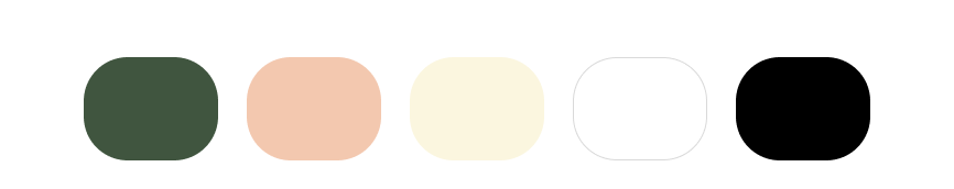
We abandoned the industry-standard "Medical Blue" for a palette that balances biological reality with clinical stability.
I engineered a high-contrast palette to guide user attention:
The Anchor (Authority):
Hunter Green (#40553F).
Usage: Primary Buttons (CTAs), Footers.
Psychology: Unlike "clinical blue" (which feels cold/sterile), this deep green signals growth, nature, and stability. It frames the doctor as a grounded expert and signal premium care.
The Foundation (Humanity):
Peach Fuzz (#F3C8AF) & Cornsilk (#FBF6DF).
Usage: Backgrounds, Highlights, Soft Ul elements.
Psychology: These tones mimic human skin and organic texture. They lower user anxiety by creating a warm,
"non-hospital" atmosphere.
The Clarity:
Black (#000000) & White (#FFFFFF).
• Usage: Typography and negative space. Ensures AA-standard accessibility for reading detailed medical service descriptions.
Semiotics:
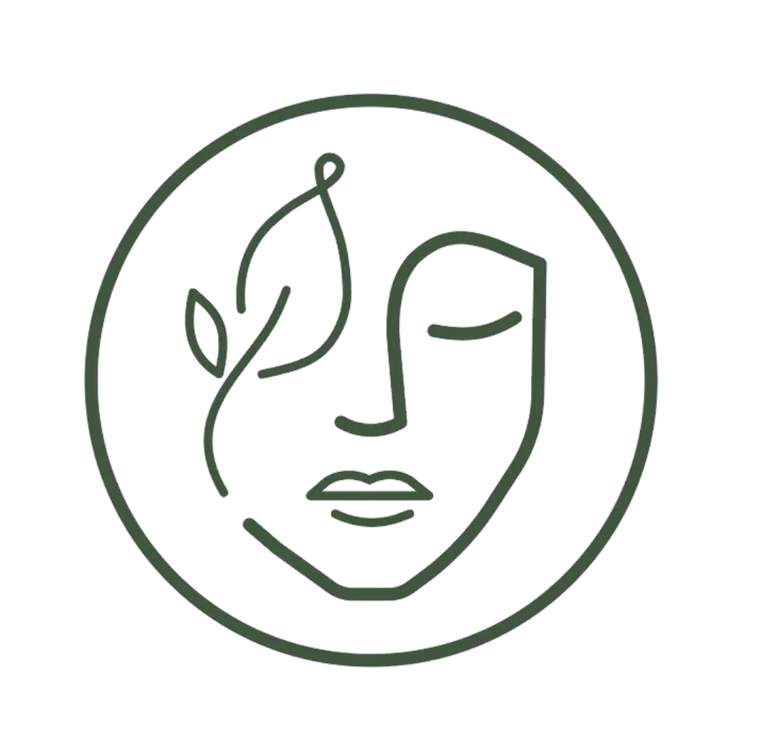
Science Meets Organic
We moved away from the industry-standard "Abstract Sparkle" or "Generic Lotus" to a custom monoline emblem that narrates the core value proposition: Natural Results.
1. The Concept - The logo creates a visual metaphor for the clinic's philosophy:
The Fusion: The left hemisphere of the face is constructed not by anatomical lines, but by a botanical stem. This signals that the treatments (science) result in natural, organic growth (beauty).
The Expression: The closed eye and relaxed mouth suggest a state of restoration, not surgical trauma. It reframes the patient experience from "painful procedure" to "meditative recovery."
The Synthesis: By integrating the delicate leaf into the strong facial structure, we signal that refined beauty is supported by strong medical foundations.
2. The Execution
• The "Seal" Container: Enclosed in a perfect circle, the mark is engineered for Social Scalability. It functions legibly as a 50px Instagram avatar (mobile) or a 2-meter lobby decal (physical space).
UX Architecture:
The "Concierge" Model
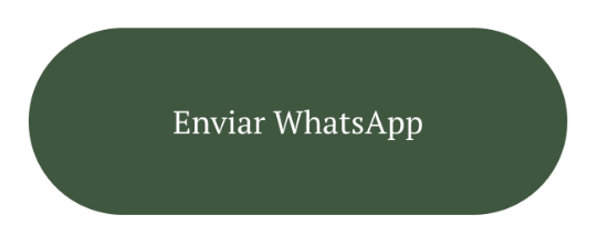
A. The "WhatsApp-First" Conversion
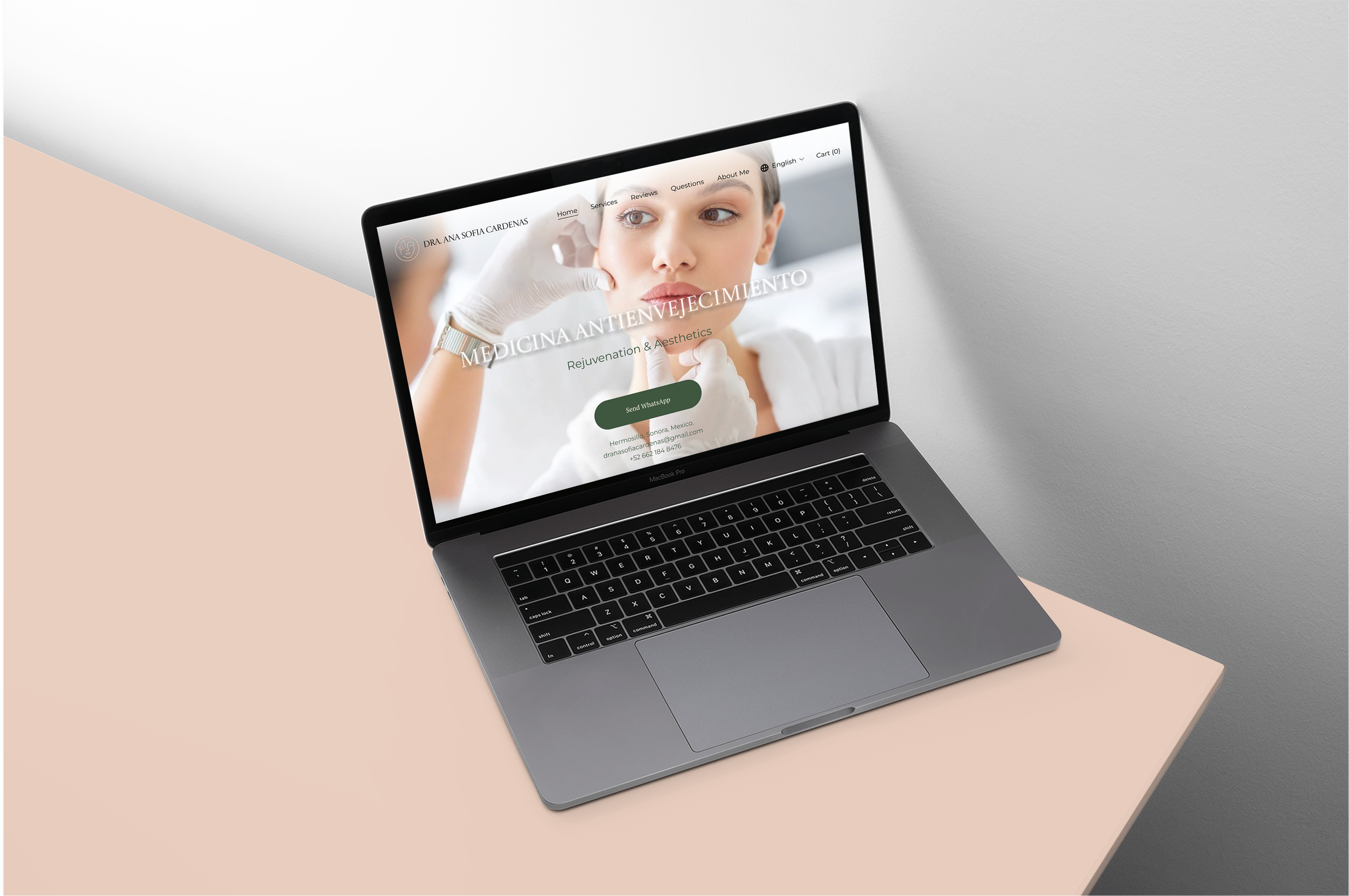
Observation: The primary CTA is a pill-shaped button: "Enviar WhatsApp" (styled in #40553F Hunter Green).
Strategy: We identified that high-value aesthetic clients do not want to fill out a 10-field contact form. They want access.
Velocity Win: Standard forms have a 3-minute completion time. WhatsApp Deep-Linking reduced 'Time-to-Contact' to <10 seconds, aligning with the urgency of international patients
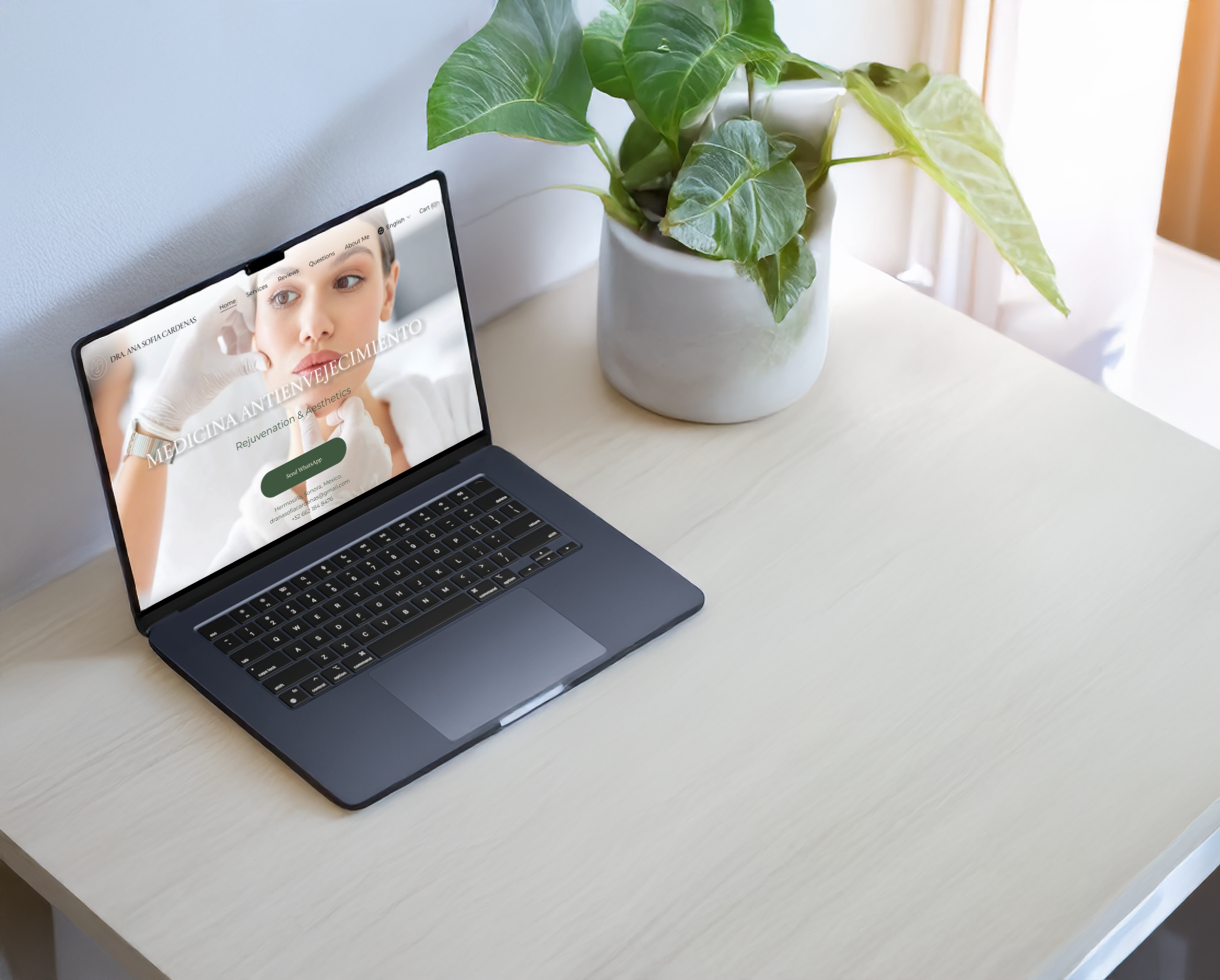
Landing Page CTA
B. Hierarchy of Information: The navigation bar forces a logical user journey:
Home (Inicio): Visual impact (Hero image of Doctor + Patient)
Services (Servicios): Rational validation.
Reviews (Reseñas): Social proof.
Questions (Preguntas): Objection handling.
About Me (Sobre Mi): Authority building.
C. Typography as Brand Voice
Headline: "MEDICINA ANTIENVEJECIMIENTO" (Serif, All Caps). This feels editorial and established.
Sub-headline: "Rejuvenation & Aesthetics" (Sans-Serif). Modern, clean, and immediately signals the bilingual nature of the practice.
Visual Trust Signals
Hero Image Selection: We chose a shot showing contact-the doctor's gloved hands examining a patient's face.
Why: This creates "Mirror Neuron" activation. High-anxiety purchases require high-touch visuals. We used imagery of 'Gloved Contact' to trigger mirror neurons, reassuring users that they will be cared for, not just 'treated'.
Interaction:
Zero-Layout Shift
Localization often breaks UI because Spanish text is ~30% longer than English. I architected the navigation and card components with flexible flex-box containers to ensure the layout remains stable during the runtime language toggle.
The Result: Zero 'Content Jumping' (Cumulative Layout Shift) when switching languages, maintaining the user's spatial anchor and trust.
The ROI of Trust
Strategic Retrospective
1. Trust is Structural, Not Just Visual : Designing for "Medical Tourism" taught me that a pretty logo isn't enough to secure a patient's trust. Trust is built through accessibility.
By treating the Language Toggle and WhatsApp Integration as core infrastructure rather than "features," we proved to the user that the clinic is ready to receive them - before they even read a single word of copy.
2. Color Psychology as a Business Filter | learned that design choices directly influence lead quality. By purposefully avoiding the "Budget Blue" used by local competitors and opting for Hunter Green & Peach Fuzz, we successfully anchored the brand in the "Premium/Luxury" segment. This shifted the initial user conversation from "price negotiation" to "availability checking."
3. The Power of "Imperfect" Geometry Developing the logo taught me that in an industry obsessed with "perfection," the human eye values nuance. The decision to contrast the heavy "structural" line weight with the delicate "botanical" leaf weight wasn't just an aesthetic choice, it was a narrative one. It proved that a brand mark can tell a complex story (Safety + Artistry) without using a single word.